Learn how to create a unique and eye-catching abstract vector design using Adobe Illustrator. Discover the various tools and techniques to bring your ideas to life in this comprehensive tutorial on abstract vector design.
From the simplest shapes you can create good looking abstract design. We are going to create a trendy vector illustration using Illustrator.

Create a new document having A4 size in Adobe Illustrator. Set the Colour Mode to RGB for a choice of pleasant, lively colours.

On the artboard, draw a 210×297mm rectangle and align it to the centre. Then add a soft grey to white radial gradient. This will provide a little depth to the design.

Choose a colour scheme of your choice. Here, I’ve used an ice-cream inspired mix of baby blues, pinks and a couple of complementing greys. Draw a square at 7×7mm, copy (CMD+C) and paste in place (CMD+F). Then press Enter. To move the square a bit horizontally, enter 7mm into the options.

Select all the coloured squares and click the New Brush icon in the Brushes palette. From the list, select New Art Brush

Go to the options panel and make sure that the direction of the brush is correct. To alter the orientation of the brush, click the small arrow button.

Using the Pen tool draw a smooth flowing line that spans from the bottom left corner to the upper third of the document.

To make some cool stripe effect, select the path and click on the recently created brush in the Brushes Palette.

To convert the path to form a shape, go to Object > Expand Appearance and then right click and ungroup the objects.

Now we need to fine-tune the stripes to different lengths. Create a temporary shape that crops all the stripes. Select the shape and a stripe and then choose Subtract from Shape Area option in the Pathfinder.

Repeat this action with all the other stripes giving varied lengths to the lines.

You can add depth to the colour of the stripes by changing it to gradient. Add some extra swatches and add lighter and darker tones. It is good to keep a copy of the original swatches to allow quick and easy colour picking.

Add some secondary elements to the design like a bunch of grey circles. Make the size of each shape different.
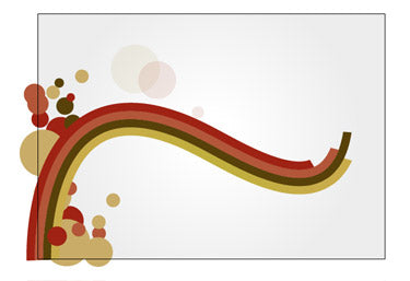
Draw a few more circles to overlap this area. Choose a different colour for them from the palette. To give some depth to these new shapes add a subtle gradient.
With a touch of transparency, you can make the image lively. Using the pink and blue colour, draw a few more circles. Then change their blending mode to Overlay to react with the colours underneath. In order to fill out the space on either side of the main flowing lines add a few objects. Either use the Overlay blending mode or reduce the opacity to tone down the elements.
A simple variation of the circular shapes is a circle with a stroke giving a ring shape that still fits in with the overall theme. Continue to draw such small shapes and give more details to the design.

Draw another circle somewhere on the Artboard. Select the two points using the Direct Selection Tool. Then, delete to crop the circle to a quarter.

To match the main flowing lines, add a thick stroke to the line.

On the end of the blue stripe, position the new curved line accurately

To break up the flow of the lines slightly, use the Overlay blending mode in order to overlap some large circle elements. Continue to add such shapes to the design. The key is to place the objects in such a way that they span outwards from the central flowing lines.

To give variety to the shapes, place objects that interact with each other.

The final image has a nice grainy feel in contrast to the clean and crisp line of the vector graphics.


