Learn how to add a professional touch to your text designs by incorporating gradient strokes in Adobe Illustrator. This tutorial covers the steps and techniques for creating stunning text effects that will elevate your designs.
How to Add Gradient Strokes to Text
Follow the steps explained below to create gradient strokes for the text by keeping it still editable.
Step 1
Choose a font of your liking and type some text with the Type tool. Here I have used my favourite font, Arial Black

Step 2
You have to set the fill and stroke of the text to none. If you don’t do this now, later on when you add new fill to the text you will sometimes see the original text colour peeking out of the text edges.

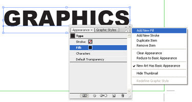
Step 3
Using the Selection tool select the text. Open the Appearance panel menu (top left menu button) in the Appearance panel and choose New Fill. Repeat the action of adding the fill one more time. This way you will get two fills in total on the Appearance panel.

Step 4
From the Appearance panel select the last fill and navigate to > Path > Offset Path and enter the size you prefer for your stroke. You can use pixels, pts, or whatever you normally use for your stroke weight.

Step 5
Now change the offset fill into a gradient and you are done. If you want to change the stroke width (really not a stroke but an offset), you can do so as you desire by keeping the text still editable!


I hope this simple and quick tutorial has made you a bit curious to explore about the Appearance panel. It is one of my favourite panels in Illustrator because of its speed and flexibility. I will suggest everyone plays around with the Appearance panel to get used to it. Given below is an example of what you can do with the Appearance panel.